
219
3826

Chopard entertains at London’s Arts Club! The LUC 1963 Chronograph Purists edition
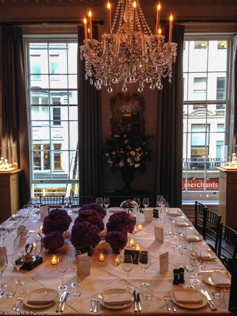
(The private dining room at the Arts Club)
At one of London’s most prestigious and noted venues, Chopard invited a selection of Purists and collectors to an evening of watches, food, and company. It was an apt location. For a watch company that prides itself on aesthetics as well as mechanics, the Arts Club was ideal. The Arts Club was founded in 1863 by, amongst others, Charles Dickens, Anthony Trollope, and Lord Leighton at 40 Dover Street, London. The current private membership is drawn from men and women involved in the creative arts either professionally or as patrons. And a year with ’63 at the end was very apt: 1963 was the year the Scheufele family acquired Chopard, and the year for which the chronograph commemorates. There is another reason why 1963 is a special year, but I will leave that for people who know why!
(Chopard Chief Designer: Guy Dove giving a talk about Chopard watch design)
And let’s face it, haute horologerie and watch design is an art form. Often an over-used term as an expression to justify some truly ‘alternative’ designs, watch design and manufacture is an art form. George Daniels certainly thought so. In considering the manufacture of a watch George believed that the dial should be simple in layout and design. Any decorative elements would only be to highlight different elements of the dial rather than decoration for its own sake. George was actually in favour of simple watches: watches that would have a singular function. More complicated watches were usually undertaken to simply show that you could! A watch should be scientific in purpose: to tell the time accurately in some respect; but there should be an art to how the watch portrays time; how the aesthetics of the dial allow the time to be read.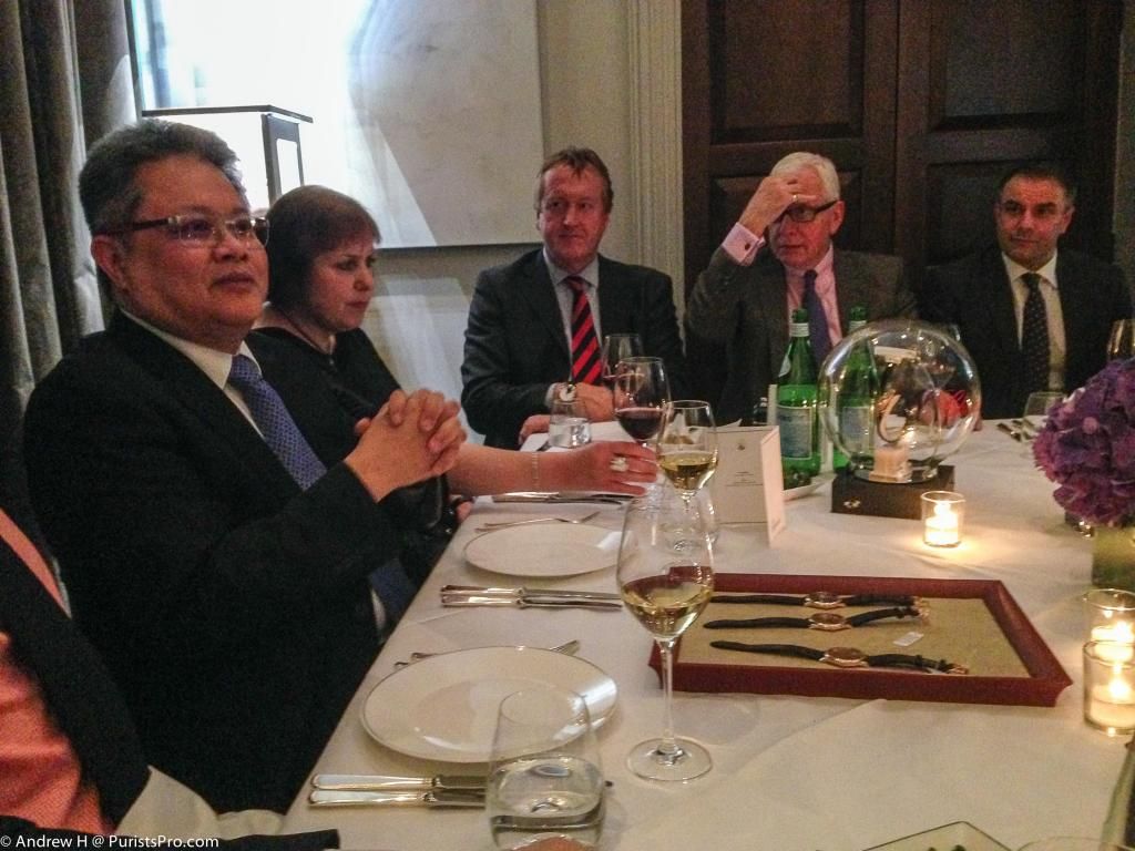
(Purists listening to MTF talk about the LUC 1963 chronograph Purists special edition)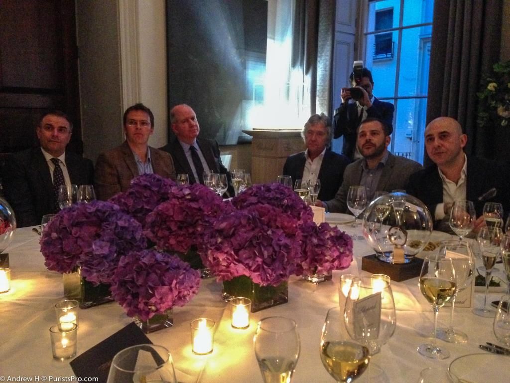
Such considerations are at the heart of the designs for Chopard. There is the same attention to detail, the requirement that the watch be instantly legible, and with the elements to be read laid out in a manner that is pleasing the eye. All of this requires an aesthetic appreciation for a watch that has to be both. It is certainly something that Karl-Friedrich Scheufele considers important and integral to the Chopard watches.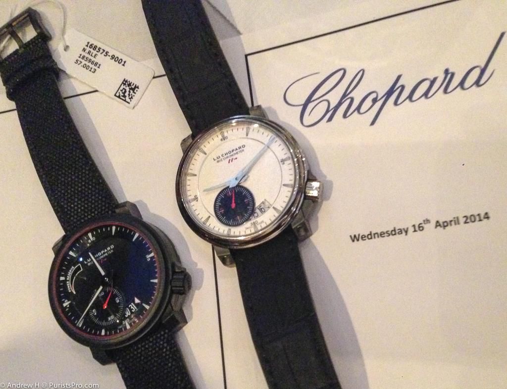
(The Chopard 8Hz Chonometer watches: last year’s limited edition to the right, this year’s limited edition in all black. Truly thought the 8Hz was a ‘break-out watch. Even in more avant-garde designs, there is that adherence to watch dials that are easy to read. Loved how the watch looked as if the dial was taken from a prototype car or aircraft).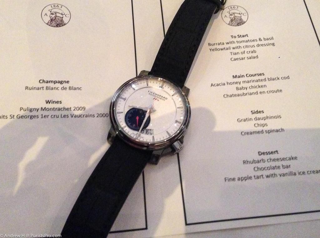
(Although such principles also apply to more classic chronometer designs: the LUC 1963 chronometer)
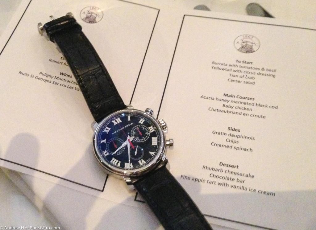
Guy Bove, Chopard’s Chief Designer was on hand to introduce the new watches from this years’ Baselworld, and in particular, the new LUC 1963 chronograph Purists special edition. This was the first time I had seen this watch and actually tried it on. I know there may be howls of protest out there that I am biased in my opinion on the watch (and fair enough), but given I had no input whatsoever to the design, and am generally not a chronograph fan, I feel sufficient detachment to comment objectively. The watch is an absolute winner! Chopard have achieved something very rare: an integrated chronograph that is chronograph only, a manual wind movement, and a free-sprung balance. Black dial, white indices, red hands, steel 42 mm case. In short, a pure watch; a watch for Purists!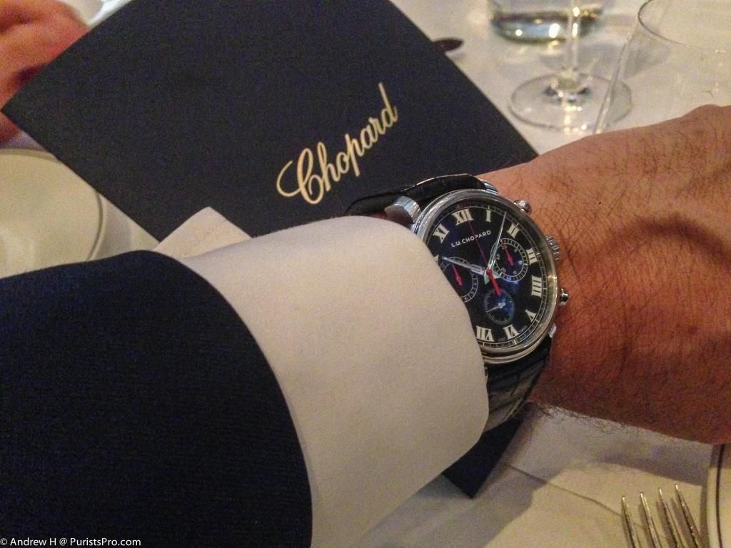
There have already been several write-ups on the LUC 1963 Purists chronograph. Most of the discussion about the design has been excellently reported in Andrew D’s article here: chopard.watchprosite.com
More recently, Kong provided some excellent live shots: chopard.watchprosite.com
Hence, the photos taken here (with a camera phone) are not up to the usual standard, but do give an idea of how the watch wears with a suit. The watch has elegance in the design that makes it wearable with more formal attire, or simply everyday. Guy Bove spoke (in his speech) of the design aspects behind the watch that were common to both the Purists and to Chopard: the authentic recapturing of the feel of handheld chronographs, the legibility of the dials, the superlative movement finishing and function, and obviously the beautiful look to the watch. 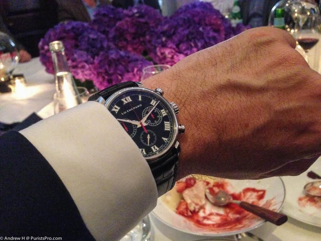
Guy then spent some time talking about the technical side of the watch and how the movement is derived from the Chrono One Flyback column-wheel integrated calibre. However, all parts for the 1963 chronograph had been crafted to meet Poinçon de Genève finishing standards, all bridge shapes had been redesigned in order to expose a maximum of mechanical functions. The bridges are all hand-bevelled and finished with Chopard’s German-silver gilded finish (that is a signature of the Heritage collection). In keeping with the Heritage range the movement was hand-wound and not automatic. The lugs to the case are nicely curved and the watch because of the weight of the steel case and the curvature of the lugs feel so very comfortable on the wrist. It fits nicely under a French cuff, and would therefore fit equally well with a t-shirt!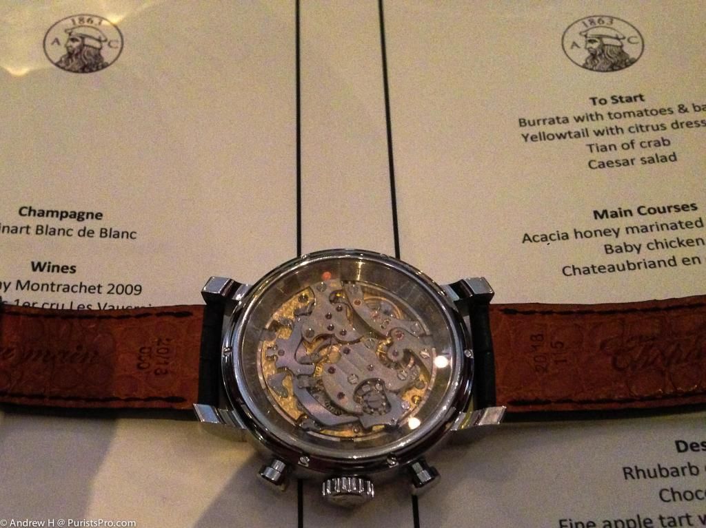
As I handled the actual watch, I was very impressed with the feel and the functionality of the pushers. The start/stop was very precise and clean. Guy told me that he had been influenced in the feel and design of old stopwatches that would be used in official timing for events. That particular attention was paid to the precise function yet comfortable pressure settings of the chronograph pushers, an important point when designing a high-end chronograph. Chopard actually went through a number of iterations at the prototype stage with different tensile pressure on the springs for the chronograph to see what setting would work optimally. Coupled, as Guy described, with the pusher shape and quite generous surface area of the pusher tips, it is a very nice chronograph to use. I think Guy has understated it a fair amount: it is an outstanding chronograph to use and few watches have the same feel and precision as the 1963 chronograph (at any price point). That the watch is also COSC certified, this is, simply stated, a stunningly aesthetic, accurate, chronograph.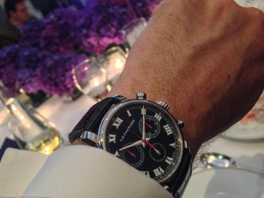
So let me return to the objectivity of my statements. I am not into chronographs. Not my thing. But then if we were all the same and liked the same thing, it would be a boring world. All too often, chronographs seem to be something that manufacturers think of doing, find a generic movement, and throw a chronograph module onto it. That is being somewhat flippant with the process, but nonetheless, the movement was not designed from the ground up. Hence, any chronograph that is going to grab my attention is going to have to be a pure chronograph. I don’t want to see a date window. I don’t want to see a host of other functions. And I want to be able to view the movement at work. I want to see a pure time measuring instrument. It therefore comes as little surprise that the chronographs I do like are watches such as the RM004. After that, the list starts to become very small! The IWC Portuguese chronograph has a very clean dial design, but you cannot see the movement. Others have messed up the dial, or included a date window, or world time. Having a hard time thinking of what else might be on the list, but sure some other Purists will help me on that!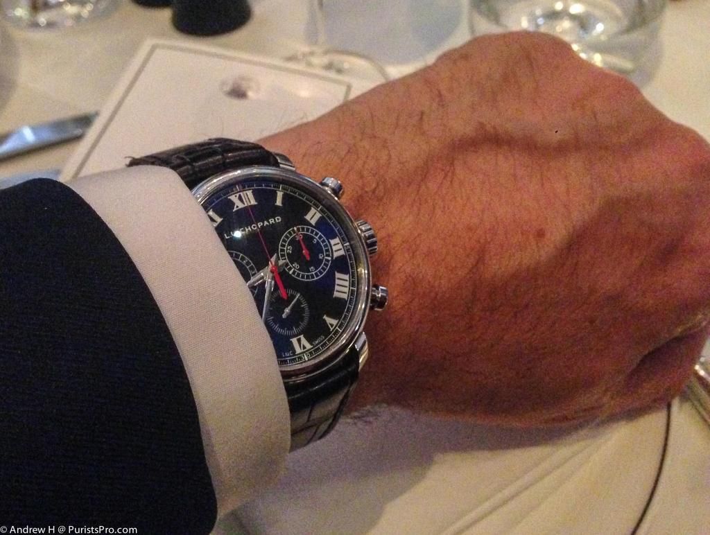
Nonetheless, this is a sublime chronograph. Purpose built, nice large balance wheel and free-sprung movement, clear readable and legible dial. What else do you want? It has a purity of purpose that few other chronographs can match. And for the money, it is probably the best value out there. My heart felt congratulations to all involved. Beautiful watch. Although I understand why, it is a shame that there are only 50 examples!
Andrew H
My thanks to Chopard for a wonderful evening, for their hospitality, and the conviviality of the gathering of friends and associates in presenting and discussing their watches. This message has been edited by 219 on 2014-04-18 06:11:31 This message has been edited by MTF on 2014-04-22 18:44:02
Chopard entertains at London’s Arts Club! The LUC 1963 Chronograph Purists edition
1963 chronometer hands blue?
That would be the lighting! And reflection from the polishing..
Interesting departure from the usual L.U.C convention
Just for clarification please....

1963 x 3

Thank you Andrew for this excellent report!