
pingtsai
[PuristSPro Moderator]
2063

Chopard L.U.C 1937 Classic - "On-the-Wrist" Review
If intellectualism, distinctiveness, refinement and tribute could be made into a watch, the Chopard L.U.C. 1937 Classic would be the resulting product. Reflecting vintage elegance and conventionalism with a hint of modern design, this watch could easily be the wrist companion of a book-smart, Thomas Pink sporting reader of the New York Times. Although to limit the look to this stereotype would be greatly undermining its technical ingenuity and historical appeal which have a way of resonating in the tastes and appreciation of just about any watch enthusiast.
Chopard L.U.C 1937 Classic Watch
An "On-the-Wrist" Review
By Ping Tsai
© October 2011
A Limited Edition of the L.U.C. 1937 was released at Baselworld 2010 to commemorate Chopard's 150 year anniversary. It was a "mechanical tribute to the manufacture's watchmaking heritage." With the many events and decisive moments that have punctuated Chopard's long standing history, 1937, also the chosen name for the watch, was a particularly significant year for the company. It was the year that the founder's grandson, Paul-André Chopard chose to leave the Swiss Jura region where Louis-Ulysse Chopard set up his first workshop in the town of Sonvilier, in order to establish the brand in Geneva. A staff of 150 employees worked under André Chopard, crafting precision mechanical wristwatches that would set the tone for the following years. It was in the subsequent period of Chopard's history that the brand built its current success, attracting customers from Scandinavia and Eastern Europe including Russia.
Case and Dial
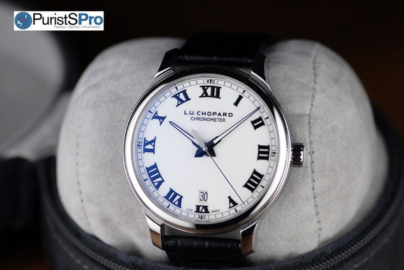
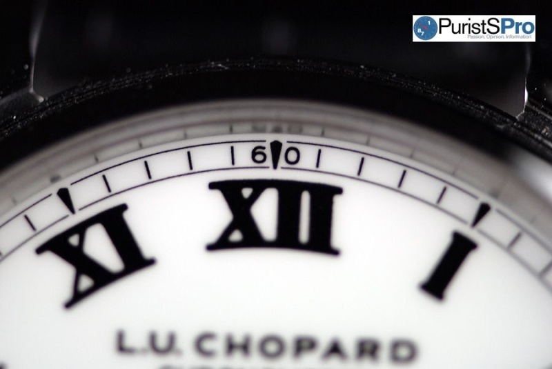
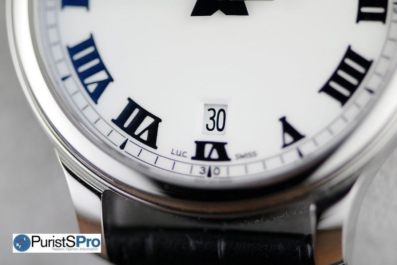
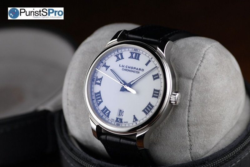
When I first saw the Chopard L.U.C. 1937 Classic, first from a photo and later in person, I found the most striking thing about the watch to be the clean white dial. From a personal perspective, it is the single most attractive feature of the watch. Bright white dials are classic and always seem to stand out, especially when accompanied by dark black numeral markers – and the 1937 has quite distinctive ones. Thick black roman numerals, which are a signature design element of many of the L.U.C. models along with the minute-track serve as the indicators on the dial. The vivid color contrast somehow has the illusion of causing the numbers to jump off the dial. Differences in finishing also serve to further provide a three-dimensional quality to the numerals. The typeface along with the minute markers are printed as opposed to applied on the dial and have a glossy finish, giving them an embossed effect and contrasting nicely with the smooth, matte dial. Although one might mistake the dial to be white enamel, it is actually made of lacquer. The clean porcelain-like surface is a much better choice as opposed to enamel because of its uniformity and the complimentary backdrop it provides to the shiny black markers. The watch is also available with a satin-brushed silver dial and polished rhodium plated numerals. The numerals on the silver version are applied and the minute track is transferred.

The white of the dial is a strong feature about the watch. However, it is also a drawback due to its size. There is a lot of empty space on the dial. On a relatively large face, the whiteness becomes more pronounced. The overall aesthetic of the dial would have been proportionally more balanced and harmonious if the case/dial of the watch was slightly smaller. In my opinion, 39 or 40mm would have been ideal for the look. Consequentially, the thickness of the numerals would have to be adjusted too. Perhaps the watch designers at Chopard were going for a bolder overall look which they did achieve. The slightly smaller proportions would make for an attractive ladies version of the model. Just as male counterparts, although handsome, can be large and clumsy, females, who are often scaled down, are likely more pleasant to look at.
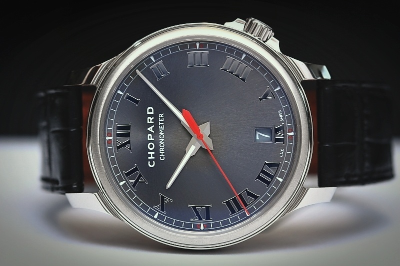
The original 1937 that was launched in 2010 had a darker brushed slate-gray dial and silver markers and differed additionally with a red second hand. Chopard took a more neutral approach in the latest version of the watch opting to replace the red second hand with a silver one. Although I personally like the minimal red detail on the original, I think eliminating it was a smart move on their part. Not everyone likes color on their watches and not everyone likes red. It can be difficult to match so a monotone approach was a safer option for mass appeal. The black Dauphine minute and hour hands of the watch are specialized for the L.U.C. collection. The superluminova fill on the minute and hour hands has an outlining and lightening effect as it extends out towards the edge of the dial. However, this also leaves the central part of the dial somewhat dark. The second hand adds to the business. It is long and thin with a graceful sweeping motion around the circumference of the dial. However, the other end of the hand is short and considerably thicker. As pointed out previously by Kong, "If the counter-weight of the moving center-second Dauphine could be redesigned smaller, it would be perfect and less cluttered in the central area." A very subtle date display window that sits at 6 o'clock completes the elegant look of the dial.
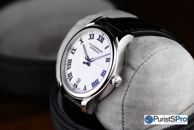
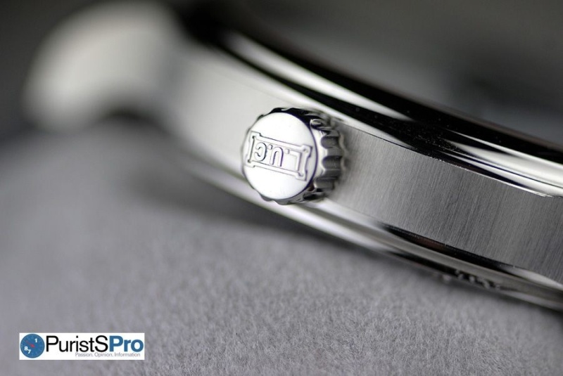
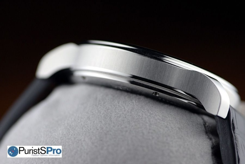
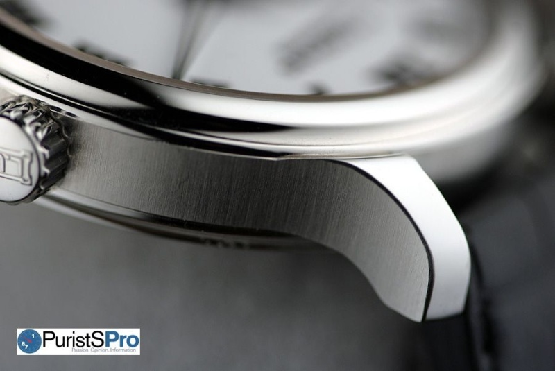
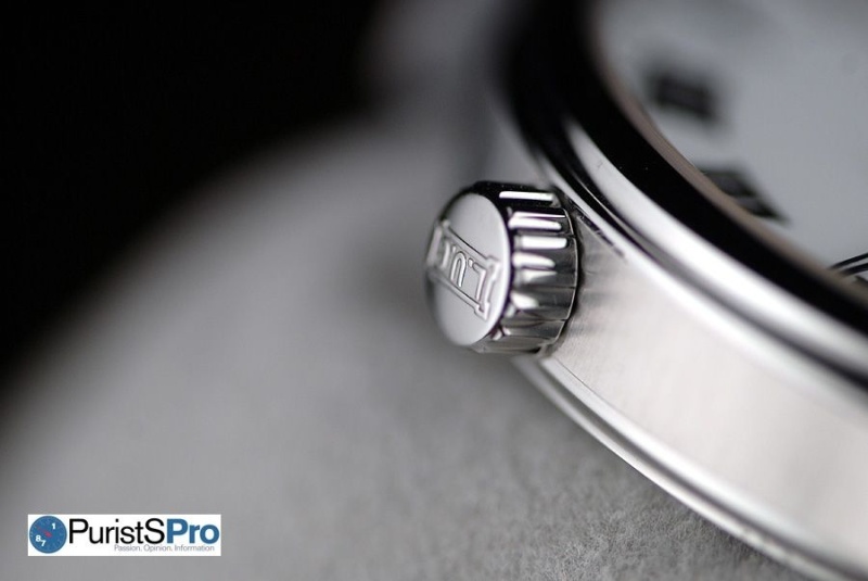
The 42 mm-diameter steel case of the L.U.C. 1937 features a classic round case with curved lugs and a screw-down crown at 3 o'clock that offers a stop-seconds function enabling easy and accurate time-setting and water resistance to 50m. The original version had a slightly more "innovative profile", sporting the crown at 4 o'clock. The case is not over-sized yet it is certainly larger than watches that were available in 1937 and several decades after that. 42mm is a good bridge between a classical and a contemporary watch. The sides of the case have a vertical satin-brushed finish and the top and bottom surfaces of the lugs and caseback are polished. This variation of finishes on the different surfaces gives the watch a more dynamic aesthetic. An interesting side profile view shows the brushed metal strip of the case sandwiched between the two polished surfaces of the bezel and caseback. The sapphire crystal is double anti-reflective coated providing exceptional clarity to the dial. The case has substantial weight when held in the palm of one's hand. The design is pretty simple and straightforward with little frills yet it is evident that the highest quality of construction was employed.
Movement
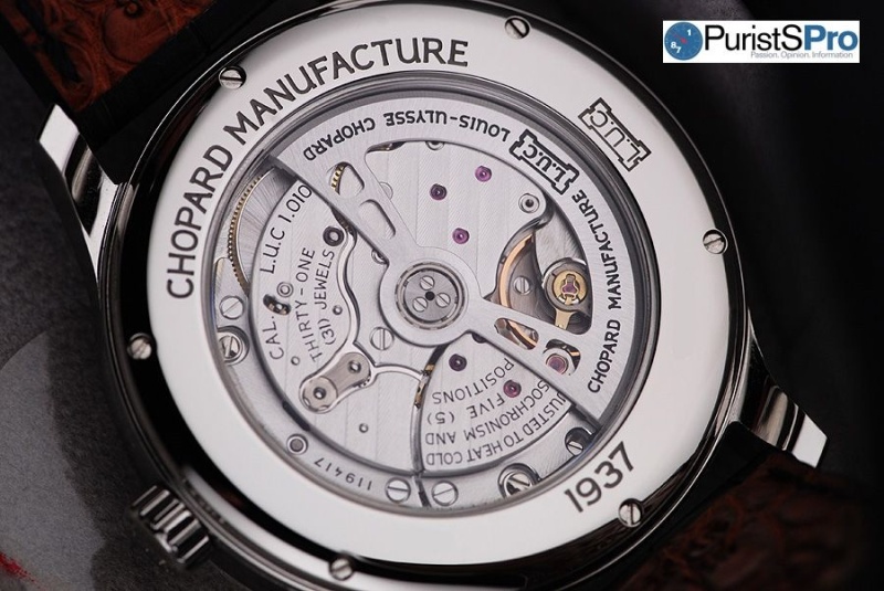
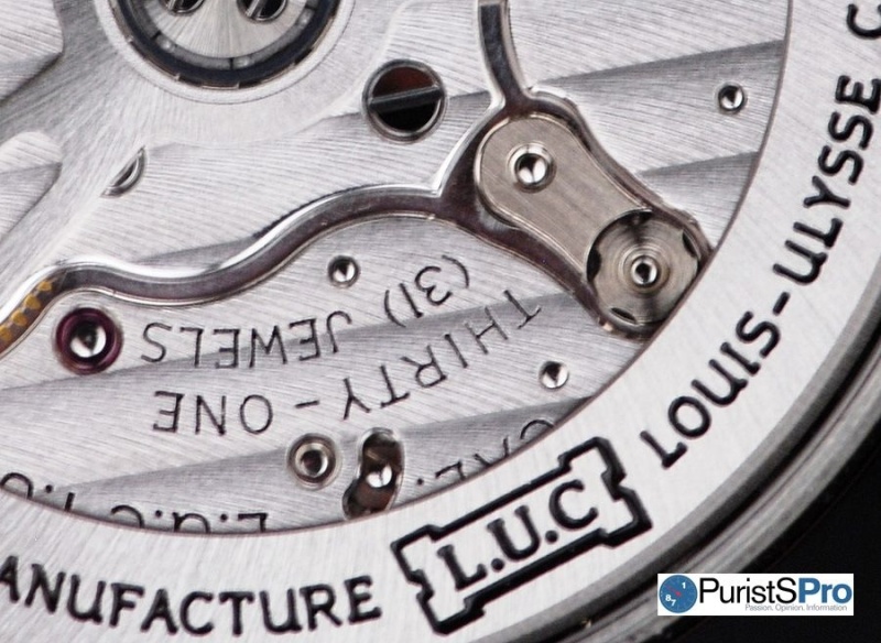
The L.U.C 1937 Classic model is fitted with the new L.U.C Calibre 1.010. The mechanical self-winding movement is visible through the sapphire crystal caseback and beats at 28,800 vibrations per hour. The Calibre 1.010 is chronometer-certified by the COSC and has a 60-hour power reserve, enough to make it through the weekend without wear. The rotor doesn't swing around continuously but rather from one angle to another with each shake of the watch. A pleasant design detail is the skeletonized rotor. It allows for optimal visibility of the movement with bridges that are elegantly finished with Côtes de Gèneve. Designed to be highly reliable, it powers the hour, minute, second and date functions of the watch. The brand claims that, "The precise and high-performance L.U.C Calibre 1.010 represents a significant landmark in the history of L.U.C movements, since its construction serves to increase production volumes and thus consolidate Chopard's independence."
Without a doubt, the L.U.C 1937 Classic is the most accurate and high-performing watch that I have reviewed to date. There were times when I left the watch sitting for a day or two without wear and it would still display the correct time. The time was always accurate to the minute.

Strap and Fit
The L.U.C 1937 Classic watch is fitted with a black alligator leather strap lined with brown alligator leather and secured by a steel Ardillon buckle. I was surprised to see that the lining of the strap is alligator too. It is indicative of Chopard's adherence and dedication to delivering the highest quality product possible. Fit and comfort are where the 1937 falls slightly short. According to male testimony, this watch "isn't the most comfortable to wear." Some of the edges along the side of the case are a little sharp. Especially areas like the bottom edges of the lugs have a tendency to dig into the skin during wear. Smoothing or rounding out some of these edges would make the watch much more comfortable to wear.


Sometimes when a truly well made timepiece is stripped down to its purest forms, the true essence of mechanical watches can be experienced and enjoyed. Watches these days often have so many additives that detract from the heart and soul of what it really is. These may be fancy cases, gemstones, overly designed dials or exotic materials. The L.U.C. 1937 Classic is a watch that captures all that is great and beautiful about timepieces in their simplest forms. A minimalist uncluttered dial, simple time, date functions, a round case and standard crown, and a movement that does what movements are supposed to do and that is to work well and work efficiently – those are the unassuming highlights of the L.U.C 1937 Classic but are what comprise a truly great watch for anyone to own.


This message has been edited by AnthonyTsai on 2012-03-02 10:45:41 This message has been edited by MTF on 2012-03-09 09:38:22
Chopard L.U.C 1937 Classic - "On-the-Wrist" Review

Very Elegant Watch...
Thank you!

Warm and elegant
I'm sure the folks at Chopard...

Superb article, Ping. As always, superbly written.
Happy to have been read by you :)

Nice review, and good observations about the comfort
Comfort of the 1937

Great post.....

Thanks a lot Ping for this great article.

Thanks Ping ...
