
MTF
[PuristS]
13383

Chopard LUC 1963 Chronograph PuristS Edition watch: Owner Review
Chopard LUC 1963 Chronograph PuristS Edition watch: Owner Review
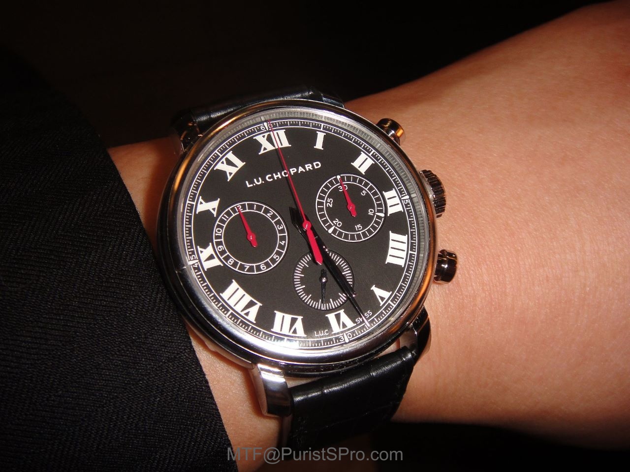
My love affair with the new LUC 1963 Chronograph PuristS Edition was evident even before the watch was conceived. That almost looks like an oxymoronic juxtaposition of cause and effect. How can one be in love before the existence of the object of one's affection?

The public canon is that the watch was first conceived at the 10th Anniversary celebration of PuristS in Las Vegas - the so-called IGOTT-2 (2nd International Gathering Of The Tribes). Mr Karl-Friedrich Scheufele (KFS) joined us in 2011 to reveal plans for a manual-wind chronograph movement and gather ideas for a PuristS edition.
Actually, early seeds of discussion had taken place between Mr KFS and me since 2007, touching on topics like chronographs, central-rotor automatic movements, LUC mechanical movements for ladies' watches, high frequency escapements, pocket watch movements and Project Berthoud; all of which, have come to realisation today.
See 'INTERVIEW: Karl-Friedrich Scheufele - Chopard Driver and Watchmaking Marathon "Runner";
CLICK URL link to read:

After the launch of the automatic LUC Chrono One (Project GT3), the next goal had to be a handwind chronograph with the spirit and execution of classic vintage racing chronographs. Chopard had no history of handwind chronograph movements but the keen observer could see the practice run that Chopard did with a Lemania-sourced handwind movement in the Chopard Classic Racing Vintage Chronograph. Finally, the LUC 1963 HW Chrono was launched in 2014 as a rose gold model with date and the stainless steel PuristS' Edition without date.
DIAL
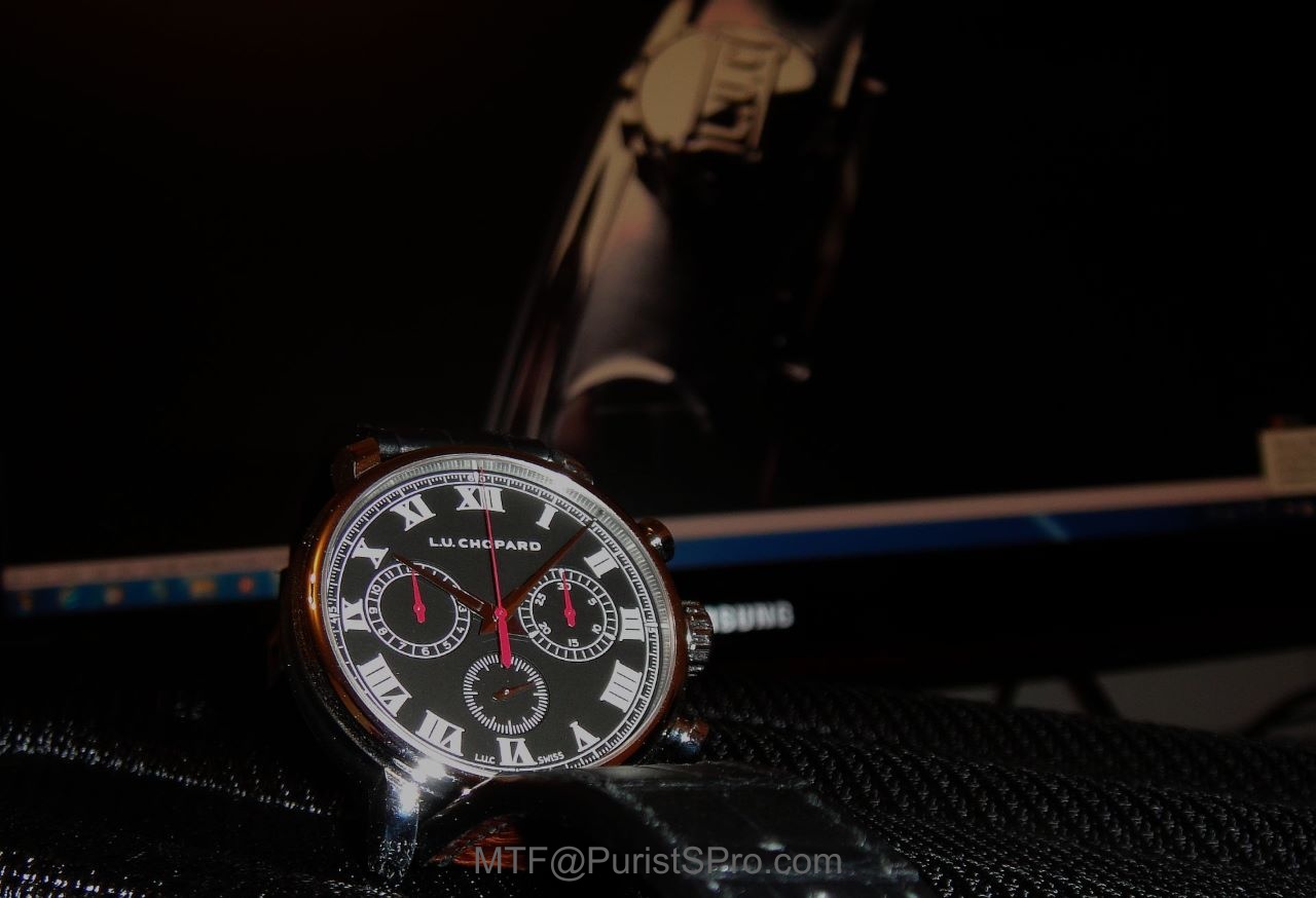
If 'The Eyes are the Windows to your Soul', then the dial is the portal to the character of a watch. The Chopard LUC 1963 Chronograph PuristS Edition evokes the classic racing car dashboard instrument with its black dial. The striking contrast of white markers on a black background with red highlights in a steel case will not be repeated again by Chopard. Despite the inspiration of automotive raciness, I feel a depth of calm when looking at the dial. This is not a flashy hot-rod but an elegant Grand Tourer.
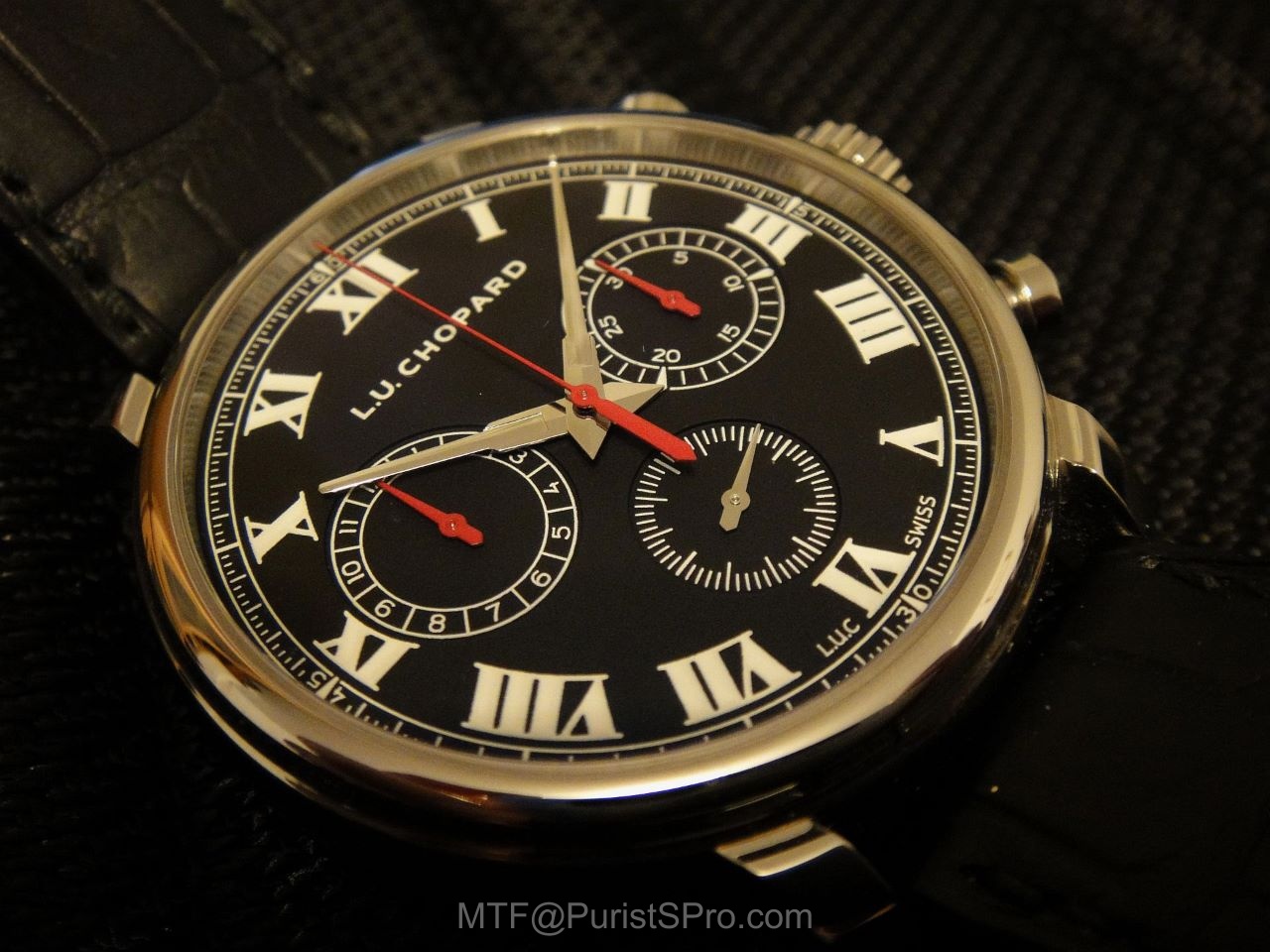
Officially, Chopard lists the background dial colour as 'black' and that is what it looks like most of the time. However, under extreme lighting, it is 'charcoal black' with a subliminal texture to the lacquer. This textured surface is important as a contrast to the glossy white printed markers. Together they give the dial a surprising depth that one would not expect from a 'black & white' printed dial. The effect is enhanced by the three recessed subdials and shiny rehaut ring between the dial and the watch crystal.
The Time markers are Roman numerals as the tradition of the Chopard watches in 1963 when the Scheufele family took over the running of Chopard & Cie from the Chopard family. The chronograph counters are marked with Arabic numerals to achieve clear separation of functions. The Time display hands are steel coloured and Chronograph display hands are painted red. For clarity, I appreciate the choice of red hands on black subdials for the chronograph functions at 3 and 9 o'clock. This is further highlighted by the red chronograph central sweep seconds hand. The railway track displays the quarter seconds consistent with the 4Hz (28,800vph) escapement frequency.
The hour markers are thickly printed white Roman numerals and the rehaut ring reflects light onto the white minute track for greater legibility. This is a complex dial with both recessed sub-dials and raised printing. The depth of the dial is also enhanced by the rehaut ring transitioning to the outer bezel. All the printed numerals and markers have a 3-D quality because the paint layers are raised thickly.
Keeping with the minimalist design, the labels ‘Chronometer’, 'Flyback' and 'Chronograph' are not mentioned on the dial and the date display has been omitted. You can enjoy the clarity of the dial because of the anti-glare coating on the sapphire crystal.
HANDS
I was one of the original protestors against the revised "dauphine-fusée" (runner rocket) rhodium-plated hands but that view has changed in actual usage. The new shape retains original dauphine 'faceted' form at the stem while conically tapered to the pointing end. The difference is that both the 'faceted' and conical surface capture and reflect light, thus allowing legible readout even in low-light conditions. The inspiration for the hands came from old compasses with the pointer sticking out of the arm evoking a pair of pincers holding a precise point.

This precise point reflects the precision of LUC movements and I appreciate that all the hands are long enough to touch thier respective markers. The slender points also hide as little as possible of the counters compared to a traditional dauphine hand.
The red sweep-seconds hand seems almost impossibly slender and does not obscure the dial at all as it glides smoothly around the dial. Sometimes I start the chronograph movement for no other reason than the sheer pleasure of a hand-voyeur.
The sweep-seconds hand resets to zero precisely; even when observed under 6x magnification.

CASE
The case is not straight-forward nor easy to manufacture; it is cambered (inspired by vintage pocket watches). The case is not stamped nor turned from a single block of steel but constructed from 5 components.
The caseband is fabricated first and then brush-polished before the four lugs (individually fabricated and polished) were accurately attached by welding. Chopard developed a positioning tool for the lugs to be spot welded onto the case and then finished. This is a traditionalist approach and the final outcome is worth the effort.
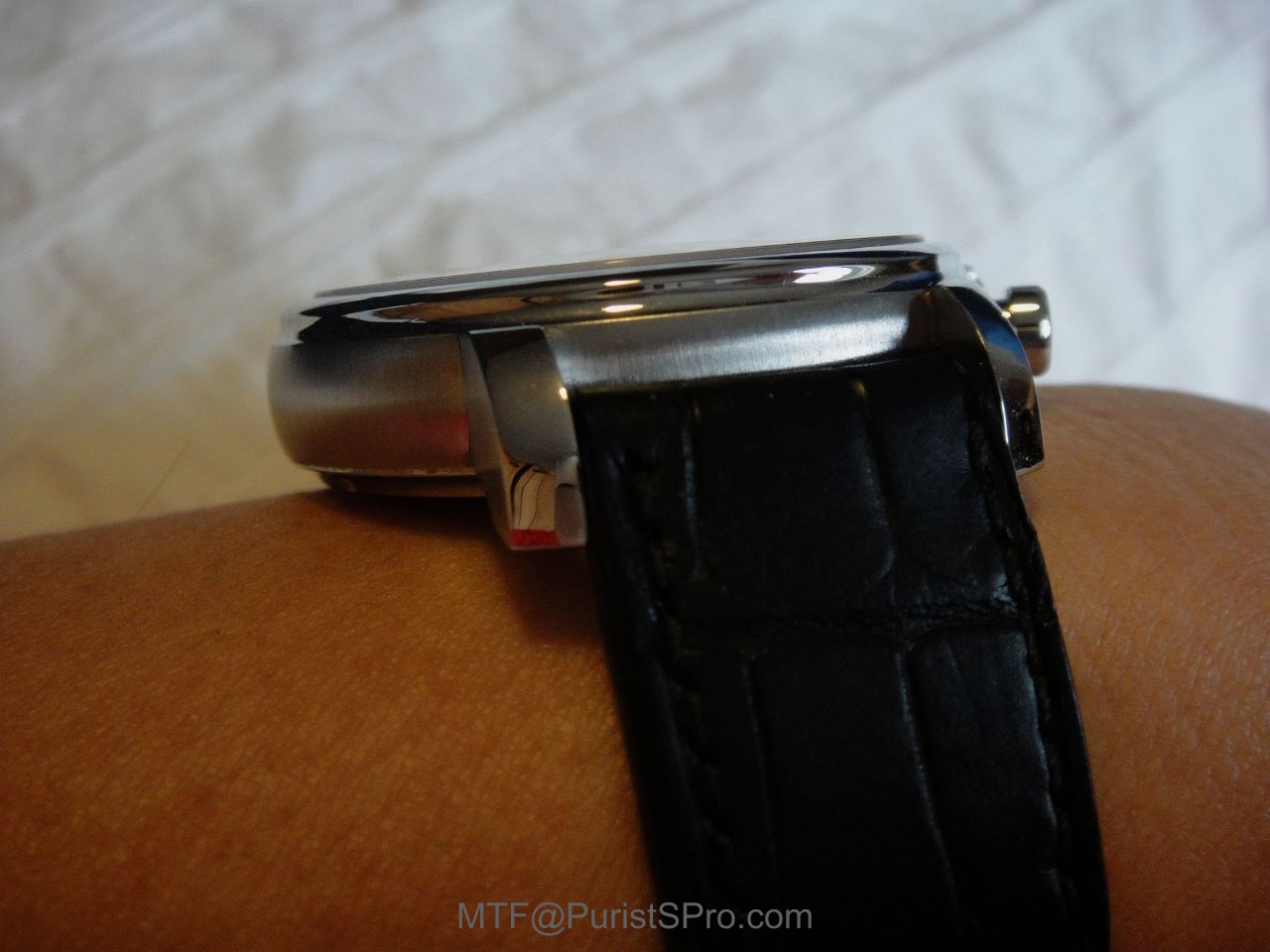
The lugs are claw-like to hug the wrist allowing comfort for a wider range of wrist sizes.

The case design is similar to the L.U.C. Tribute pocket watch. It is 42mm in diameter. During the design phase, we considered a 40mm case but the watch looked too thick. The final diameter allows for larger chronograph counters and a railway track to give the best layout of the dial with perfect proportion. The round pushers are in keeping with the vintage racing look and differentiates from the oblong pushers used on the LUC Chrono One.

Not content with the satin-brushed finish on the side of the lugs to match the caseband, Chopard has given the tops of the lugs a mirror polished finish, following the curve to the tips and undersides. All this is to emphasise the conclusion that the polishing process for this case is more than complex. We may not notice the presence of such subtle details but we would surely notice the drop in perceived quality by their absence.
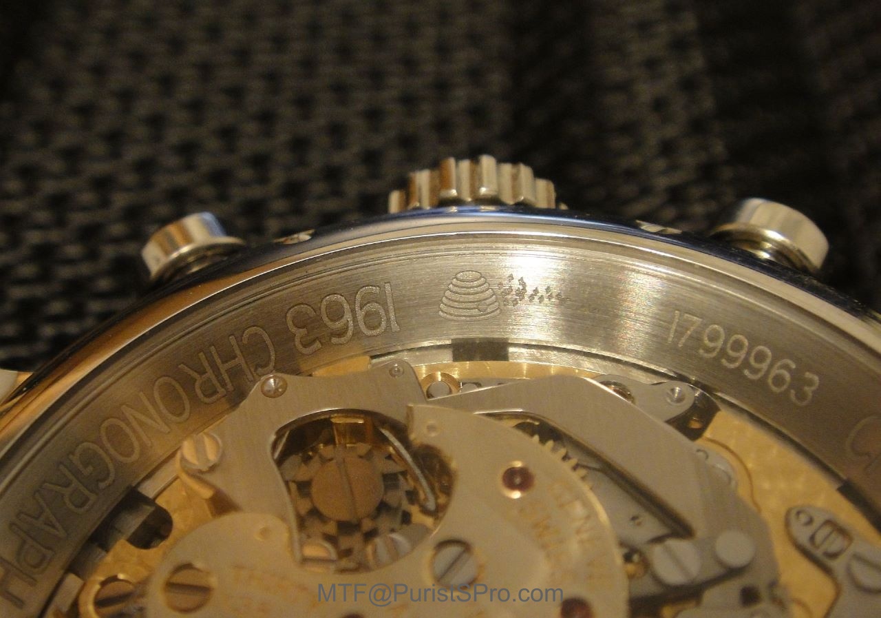
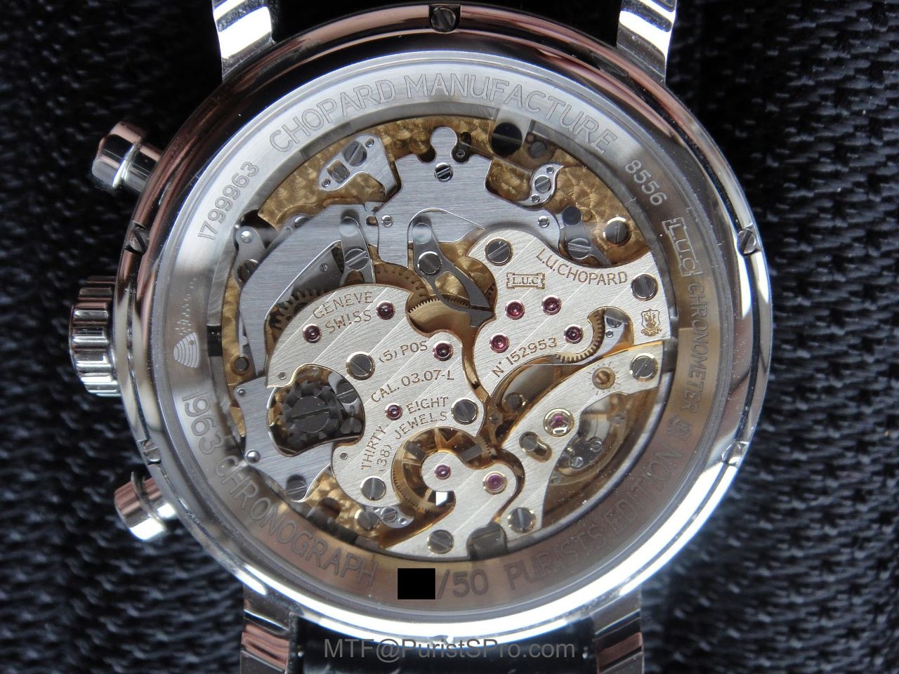
Apart from the case material, the PuristS' Edition case differs from it's rose gold brethren by having two extra engravings on the back bezel: the LUC rectangular logo and the 'Beehive' that has come to mean so much to PuristS. They also pay hommage to Louis Ulysse Chopard and the original bee-keeping traditions of the founding family.
MOVEMENT
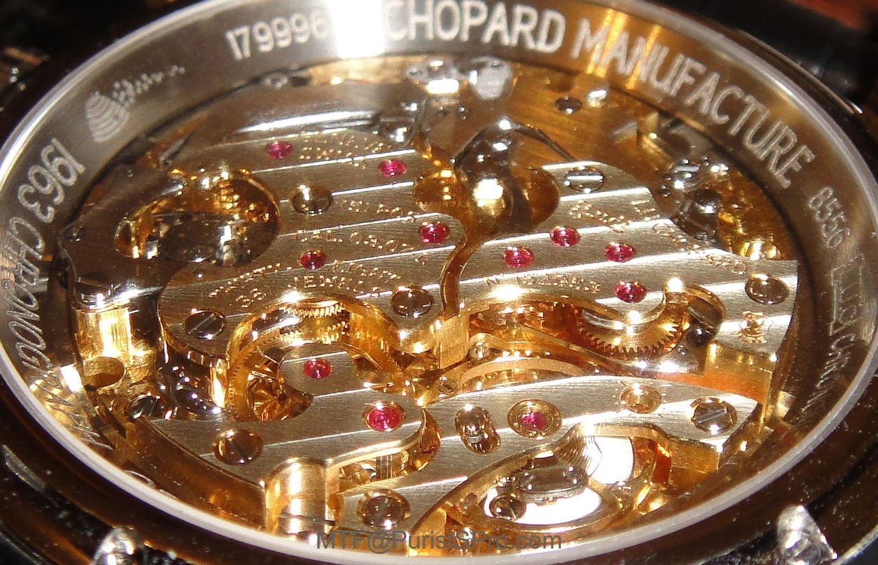
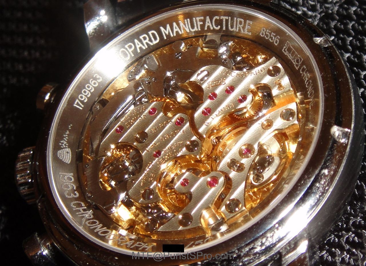
The movement is in an arena (amphitheater) case back to display the components perfectly without a winding rotor in the way. The bridges are made of German Silver and hand finished to a very high standard. The bridge forms exceeded the requirements of functionality as their curves, dips, corners and tips are all complex shapes to accentuate with hand-finishing and provide a canvas of expression for hand-made workmanship.
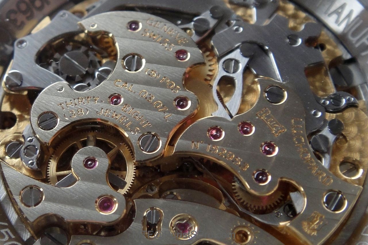
The column wheel is the heart of the flyback chronograph movement and even that is finished superbly.
Chopard purposely made it difficult to polish with acute internal angles and tight corners that cannot be done by machine. The result looks more like a pocket watch movement bristling with purpose and solidity. The watch carries the Poincon de Geneve (the Geneva Seal) as it is assembled in the Canton of Geneva to exacting standards of design, decoration and finishing.

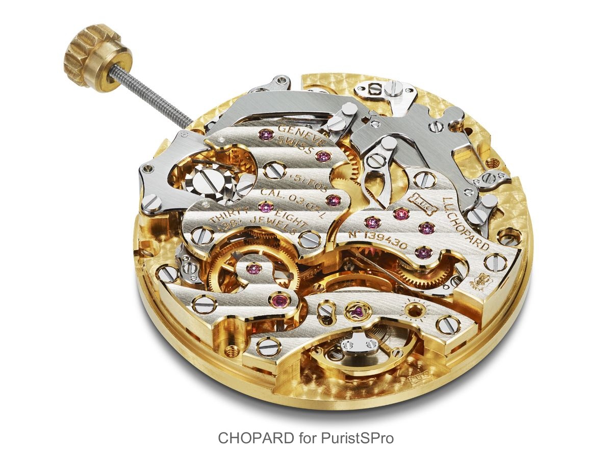
GT7 movement with date dial side

GT7P movement without date dial side thus requiring a new mainplate
The PuristS' Edition specified no date display so the movement was actually modified with a new dial-side mainplate. decorated to the highest standards even if unseen.
The crown setting mechanism was also modified to provide only two positions - time setting and locked. The 50 GT7P-Chrono sans Quantieme movements were specially homologated to Geneva Seal standards and thus may be one of the rarest LUC movements.

New crown setting mechanism CAD image

PUSHERS and CROWN
The pushers and crown are also crafted from steel with a high gloss polish. The crown is set in line with the pushers - such is attention to detail at Chopard. The pushers are round discs on stems and more elegant than the pushers on Chopard's own Classic Racing range, as befitting a member of the superior L.U.C. family. The crown is marked with the LUC logo.

STRAP and CLASP
The watch is mounted on a hand-sewn black alligator leather strap lined with cognac-toned alligator leather. Like a bespoke suit, the lining of the strap is as good as the exterior. Functionally, the sweat resistance and appearance on humid days is good.

The stainless steel pin buckle is marked with a crisply engraved LUC logo.
FUNCTION
When we started the project, Mr KFS and I used the finest examples of Swiss, German and Japanese chronographs as the benchmarks. The objective was to create the best new handwind column-wheel chronograph so the benchmarks were not to be copied nor replicated.
Were we successful?
Resoundingly...YES!
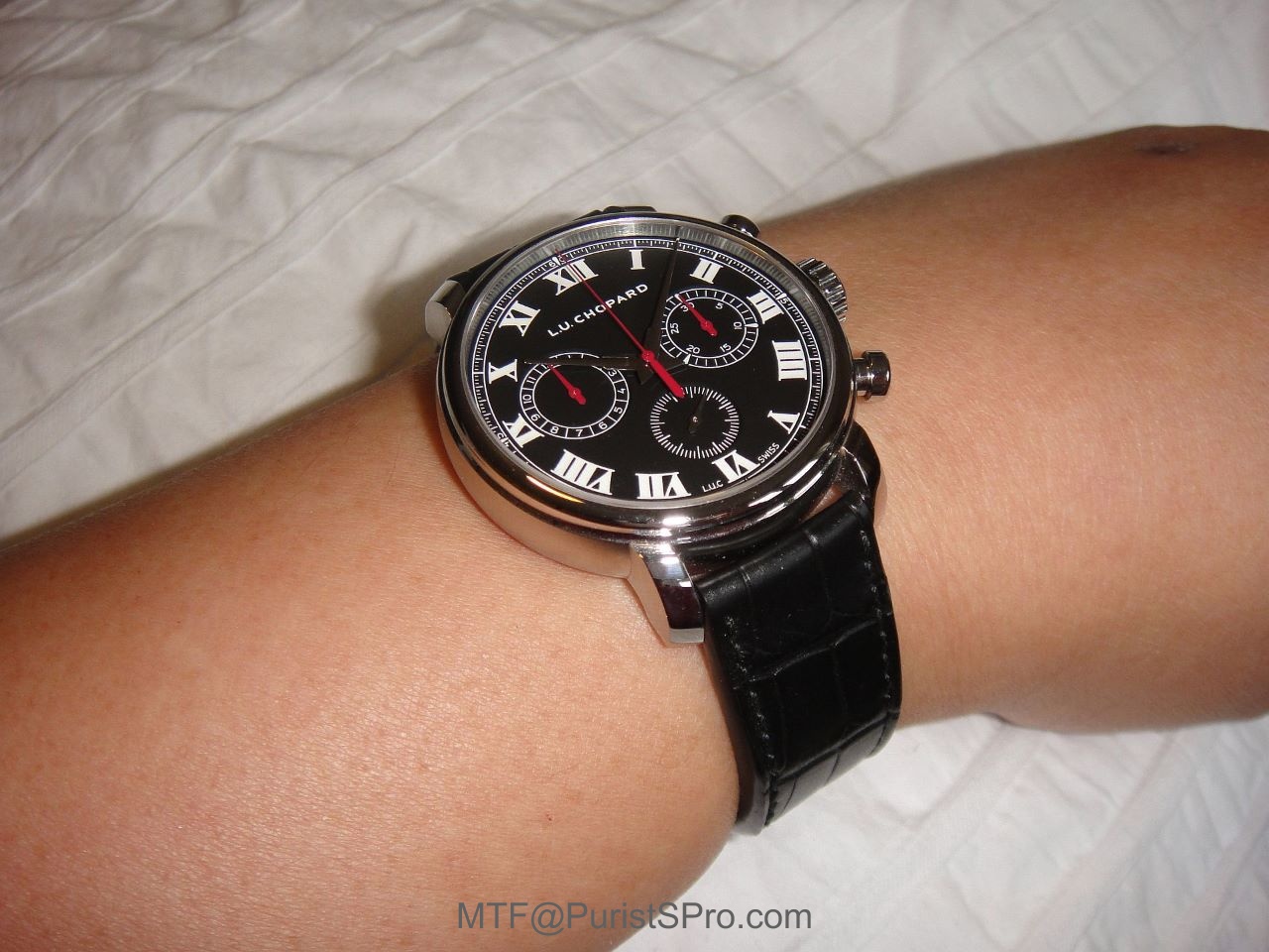
The time display is clearly displayed by the steel hands on the black dial with white Roman markers.
The chronograph displays are instinctively read from the dedicated red hands. I prefer my chronograph displays to be white font on black background so this L.U.Chopard 1963 Chronograph PuristS' Edition is clearly the best with the font size visible even to my vintage eyes. There is no date display to distract on the minimalist dial.
The STOP/START pusher action is predictable with a consistent 1 mm of smooth free play before the break-action. There is no detent and the break-action is crisp and instantaneous. The START and STOP actions are identical in feel and in the force required, with no discernible inertia or 'jump' of the central seconds’ hand. The hand stops instantly without hesitation between two ticks of the gearing.
As the seconds hand sweeps, there is no discernable jerkiness to the naked eye. The 4Hz escapement can only be be deduced from the regular impulses of the hand-tip seen with a 6x magnification loupe. The FLYBACK action is instantaneous and operated by the pusher at 4 o'clock. The RESET action is precise and light without harshness. To the naked eye, no discernible whiplash could be seen.
The power reserve is at least 60 hours, as advertised.
On my electronic timegrapher, the rate was 0 to +1 sec/day in 'dial up' and 'crown down' positions. All other positions showed +3 secs/day. This is far more precise than COSC limits and I am mightily pleased!
CONCLUSION
The reader must now be aware of a degree of bias on my part as a co-designer of the watch but after controlling for that bias, I conclude that my Chopard LUC 1963 Chronograph PuristS' Edition exceeds expectations; even my very high PuristS' expectations.
This is 'currently' my best flyback chronograph, irrespective of cost. I have chronographs costing 5 times more that are not in the same league for aesthetics, finishing, precision and function. Although the scientist in me has to qualify my conclusion with the modifier "currently", I suspect that I am unlikely to find another chronograph that surpasses it in my remaining lifetime.
The best thing is that if your taste runs to precious metal and date display, the rose gold LUC 1963 Chronograph is also available from Chopard, albeit also in a limited 50-piece edition; so hurry!
PROS
1) Excellent aesthetics and finish.
2) Superb legibility.
3) Sublime chronograph pusher action.
4) Superlative chronometry.
CONS
1) Some levers, cams and yokes appear thicker than expected although finely finished with satin-brush decoration.
TECHNICAL SPECIFICATIONS
L.U.C 1963 Chrono PuristS Edition Ref. 168556-3001
Limited edition 50 pieces
Case
Material Stainless Steel
Total diameter 42.00 mm
Thickness 11.50 mm
Water resistance 50 meters
Crown Stainless Steel with L.U.C. logo
Crown size 8.00 mm
Crystal Glare proofed sapphire
Case back Open
Movement
Type Mechanical manual winding L.U.C 03.07-L (GT7P-00-12)
Diameter 28.80 mm
Thickness 5.62 mm
Number of jewels 38
Power reserve 60 hours
Frequency 28,800 vph (4 Hz)
Finishes Bridges adorned with Côtes de Genève motif
Certificates COSC (Official Swiss Chronometer Control) & Poinçon de Genève quality hallmark
Dial Black dial
Hands
White hours, minutes and small seconds’ hands
Red sweep seconds-hand, hour and minute counter hands
Functions and displays
Central hours and minutes
Small seconds at 6 o’clock
Flyback Chronograph function:
Sweep seconds-hand
30-minute counter at 3 o’clock
12-hour counter at 9 o’clock
Strap and buckle
Hand-sewn black alligator leather lined cognac-toned alligator leather with Stainless Steel Pin Buckle
© Dr Melvyn Teillol-Foo, 2015

Chopard LUC 1963 Chronograph PuristS Edition watch: Owner Review

This is not a watch ...

"Basically is a simple chronograph, classic and chic"

Nicely done, MTF.
Great review Dr. MTF
Melvyn, this watch certainly gets my attention

Context is Everything
Melvyn, thank you for the explanation
I'm rapidly growing to like the Red....

It's better to look good in-person than on PR shots

Gosh, I feel...

Some pieces still available to PuristS

Manufacture Recommended Price


